I have always beleived that airports are the one place that show people in their true form. Everyone has a destination a mission and it is interesting to watch the different personalities. I am no exception to this either.
Today, the Sunday at the close of Thanksgiving weekend, I have missed my connecting flight. A combination of weather, human error, and preventable measures by the airline such as waiting five minutes for my flight to arrive could have avoided this post and my now four hour layover.
Still all of what I have written is just to introduce the true confusion. Knowing I need a flight to Pittsburgh the airline attendant tells me I am on standby for a two-legged flight leaving in five hours. I was already on one leg and did not want two more on top of my new-found delay so I ask if there are flights on any other airlines. I am told they cannot interface with the other airlines from within security and they cannot help me. Calling my family we are able to find a direct flight leaving in half the time weather permitting that is cheaper.
So now I am waiting for the cheper, direct flight and I ask:
Why can anyone with an Internet connection reroute my travel plans from essentially anywhere in the states but the attendent at the airport can't even col up my flight information?
Sunday, November 30, 2008
Thursday, November 27, 2008
When do names catch up with technology?
The carriage became the horseless carriage and is now called the automobile or the car.
Cellphones are slowly going through the same transformation. As technology changes the actual system no longer exists. Cell phones are being called mobile phones or mobile devices on a more frequent basis. This is an appropriate transition considering fewer and fewer calls are made using the cell technology of the early eighties.
Still on the plane today the pilot asked that all electrical devices be turned off including cell phones. This prompted this thought knowing that mobile phones do not interfere with plane signals. Believe me, I am glad people cannot talk on phones in airplanes. It does make me wonder though when society catches up to technology.
At what point will airlines no longer refer to cell phones? Is it one final technological leap we are waiting for or is there a social tipping point when terminology changes. What is the needed saturation point for technology's appropriate or correct term to make it into the mainstream?
Everyone understands usability
It's true. On some basic level everyone understands usability and the difference between what is said and what is meant. It is the common example when a user says they want a handle on a product they really are saying they want to be able to move it from one place to another with ease.
The same happened on my at to the airport this morning. Pulling into departures the cab driver asked what airline. Tired and without thinking I responded that I already have my boarding pass - any door will do. Now I was not thinking "what does he mean by this question?" instead I implicitly understood why he as asking my airline - not to make conversation but because he knows the pairing of doors to airlines and he can make my morning easier. As the passenger I would normally make this assumption and provide my flight information.
Maybe it us because Pittsburgh is a central check in with the gates in a separate building and drop off points are limited but this brief interaction shows that everyone understands usability. The driver did not ask what door I wanted and I did not respond with unecesarry data.
It is always interesting to see real world applications of tools and methods that interaction designers and researchers use and act as if we discovered.
Wednesday, November 26, 2008
No wonder users are confused
The topic says it all. I have been in my apartment four months and just this morning I noticed what is wrong with my range. And no I am not talking about the mapping of burners to controls. What I mean to discuss is the labeling. Both my microwave and oven are Whirlpool and one is positioned above the other in typical kitchen layout.
Still, the control on one reads "cancel/off" an the other reads "off/cancel". Now these ate two devices, often paired and the language is different for be same action. This then led me to think about other repetitive and confusing commands. Keyboards have enter and return keys. A logical and necessary separation in the days of typewriters. But wholly useless and confusing in modern day computing. I can tell you the technical separation between the task but not the axtuallbreapn the two are still separated in modern computing.
Even in he iPhone there is a done send and return button on my interface. Which performs what action? The only way to learn is to try and risk losing my data.
It is with this in mind that I challenge designers and corporations to design consisent products and identities. I can offer more examples both win the iPhone an elsewhere but I fine it interestingbto discover where systems are inconsistent. A company can not assume a user should see a solution without proper design and the first step toward this is consistency in one direction or another.
Tuesday, November 25, 2008
Now I can post my gripes
An aside: u found a free blogger application for the iPhone. I can't tag posts or edit the tyeface but at least I can post and modify the appearance later.
To start, this will not be a very technical post instead a compokagion of some of my initial iPhone reactions. I am trying to publish where I stand on the battle for iPhone functionality and don't intend to uncover any new truths. Topics will be described byname, my awareness to them prior to purchase and my current feelings gowards the mater.
Copy and paste
Known
Agreed
Nothing new to add to what the Internet critics gave already said.
Notification LED
Known
Underestimated, disagreed
I thought this was a minimal complaint of balckberry converts. It would be great go kniwnif k have a missed call without interacting with the device and, perhaps more importantly, know if the device is evenin.
Better camera, flash
Known
Disregarded
Owning the device though, I wish it had both
Customization of hiding unused native apps
Unknown
Wanted
I have a sutuon for the application I am designing, why doesn't apple?
Landcape keyboard in more applications
Known
Disagree
I initially thought I would want this. As I peck at the portrait keyboard writing this post and autocorrect covers for the size of my finger, I was wrong. It works great as is. It might even be faster given the Fitts law sudd of life.
Battery life
Known
Underestimated
But this kachina needs it.
Customize dictionary
Unknown
Wanted
Why can I turn off autocorrect thanks to firmware 2.2 but I can't add my own shorthand? Rimm definitely has the victory here.
Multiple apps
Known
Agreed
Though in all honesty they need a better battery first.
Louder ring, better vibrate
Known
Underestimated
But if my phone is in my pocket on the other end if my short desk you might as well put up smoke signals.
So I said nothing
New but I felt obligated to post my iPhone wishes now that I am a full user for a week
Saturday, November 22, 2008
Designing Products and Designing Cases
Industrial design has always had to fight the belief that designers are simply decorating a functional object. It wasn't until the early 20th century that designers started manipulating materials in a way that the world started looking at products as designed objects and not just functional tools.
Jump to the present day, corporations are hiring designers left and right to try to make their products on the cutting edge. Apple has been at the forefront of the market in computers, mp3 players, and recently mobile phones. Having just purchased my iPhone and joined the smartphone world, my post will focus on that.
Along with my iPhone, i purchased two items: a screen protector and a case. This made me think: Apple spent countless hours developing the iPhones interface and physical form. As the end user, I bought the phone for these reasons and feel that the device itself it an elegant piece of design. I do not want to scratch it, dent it, or in any other way hinder the design. So what do I do? I put the phone in a case. I no longer see the clean plastic back, the sharp edges or the overall form obssessed over by Apple designers for so long.
So my question is two fold:
When does an object become so well designed that people are afraid to use it in its natural form for fear of breaking it
and
When should a case be designed, used, and obssessed over as much as the form it supports?
Cases are by their very nature a protective service against the elements. But when we are dependent on a shell and that is all we see, the case should be attractive as well. There is a limit though - for if the case is too attractive then would we need a protector for our protector?
What are the limits on clean design and when is too much reached?
Friday, November 21, 2008
Intuitive versus Logical - The Blackberry Strom Keyboard
When I posted my initial review of the Blackberry Storm a week ago, I mentioned I was dissapointed with the interactions needed to show and hide the keyboard. The system as I interpreted it required a single touch to call the keyboard to the screen and three steps to hide the keyboard. Since then, I have learned a second method to close the keyboard:
Simply swipe in a downward motion across the keyboards overall target area and the field will dissapear.
When I first read about this feature I thought "wow, how intuitive". In closer inspection of the interaction, I realized I mislabeled the interaction. There is no affordance (to add to the abuse of the term) that the keyboard closes at all. No virtual hinges, no hatch marks or trianges to denote any type of interaction. It was with this in mind I rephrased my discovery to "wow, how logical". The entire interaction makes sense after all - once it was shown to me. I thought "how could I miss that?!" If I were a random user I would have accepted it as a great solution and should have known better.
That is not the case though. I do know better and it shouldnt be the user who feels responisble for 'you shoulda known'. The only reason I discovered the interaction is because, in my waiting for the device to actually release, I read every piece of documentation I could get my digital hands on. That is not normal. I never read manuals and I would be shocked if the majority of people read much of them at all.So yes, I will admit in the UAR world this is a minor problem with easy learning and little persistence. But the feature is so rich that it should be learnable.
So to return to the subject of logical and intuitive. Logical interactions are not a replacement for intuitive interactions. A system is no good if the user spends half of their time not knowing about a rich interaction. (based on the two year contract for mobile phones) There should always be some way to display action and direction of functions, even if it is easily learnable. I want to clairfy, this is not an excuse for ad hoc overbearing labels, tags, and callouts. The system should intead talk with the user and not to it. To interact in a subtle way without additional clutter (remember combinatory explostion from psychology?) It is the challenge of interaction and interface designers to find this balance and I challange RIM to offer an alternate solution to this simple design issue.
When does Feature Creep Hit?... the iPhone
Feature creep, the swiss army knife effect, Ockhams Razor. Call it what you will. They all discuss the same thing - simplicity - the fact that the simpler and more elegant solution probably wins.
So what is the threshold, or tipping point, for feature creep? How is it measured? When does a tool begin to lose its utility due to an overload of function?
When the iPhone was first launched is had 18 (?) applications. There was no third party application store and firmware updates were to fix first generation bugs. Jump ahead ~18 months and we have pages of applications and Firmware 2.2 releasing mere weeks after 2.1. Looking through the App Store, I see over half a dozen instant message applications, more RSS feaders than there would be sites in my own, and multiple applications offering the desired copy and paste function. The firmwar updates are now adding features to keep up with the market, on top of their functional advances. So when does this overabundance finally hit the point where the iPhone is no longer graceful in its function and it is instead another clunk tool? I recently came across the sit of http://pleasefixtheiphone.com/ Many of the requests are known and have been addressed, or at least acknowledged, by Apple(notorious copy and paste push, camera quality.) Others simply cause me to shake my head and wonder. Feature requests range from drop down menus to zooming into video playback, to being able to use the iPhone as anything and everything under the sun.
This makes me think of the story "if you give a mouse a cookie". Well, Apple has opened pandoras box with the AppStore allowing third party developers to fill the gaps Apple is leaving open. Some Apps have been refused only to appear in a Firmware update. That leads to the main question of when should a feature make the leap from third party development to a native feature? When does Apple daw the line and what will set the iPhone apart from Windows Mobile and Blackberry devices when that time comes?
So I do not offer a solution here. I only ask the question that feature creep is about as unavoidable as Kleenex being synonymous with tissues and when it happens, how do you keep your product separate from the mass?
Friday, November 14, 2008
RIMM, you convinced me to buy an iPhone
Anyone who knows me is fully aware I have obsessed over the pending release of Blackberry's first touch screen device (the Storm, scheduled to be released November 21) for the last 12 plus months.
This morning I had the privilege to play with the device at a 'first touch' event and, though it was still beta software, I got a good feel of the device. Overall, I was not impressed. That being said, I kept the words "not final release" repeating in my head but I think I did a good job of separating beta release issues from true technical and interaction issues.
The top ten reasons I am disapointed with the Storm, in no particular order:
1. Haptic feedback
Over the last year I was led to believe the Storm would provide haptic feedback similar to the Verizon Voyager with a grid of speakers and localized bounce upon selecting a screen item. Instead, the whole screen is a single button, in a similar fashion to Apple's new track pad on their notebooks. While I think this could work on a notebook (haven't had the opportunity to try it) I think it completely defeats the purpose in a mobile device. Users rely on physical feedback to blindly type and find buttons in their pocket but that is not possible with a single feedback source. The entire concept of haptic feedback is voided by the inefficiency of the solution.
2. Suretype - Keyboard
They still use multitouch or suretype (user controlled preference) as the input method in the portrait mode. Apple was able to fit a QWERTY keyboard in portrait mode, why cant you? Suretype does not work for a touchscreen, plain and simple.
3. Suretype - navigation
The Storm does a great job of separating TAP from SELECT. Being said, target areas in lists are too small at the default size and I tap at a force deemed a click. Now this, I will outright admit is a learned motor skill, and the sensitivity can be changed but I like to think some basic testing could have uncovered this. Also, the need to tap a selection, then click it again (yes, you can click right away but then there is no confirmation that I selected the correct field) adds roughly 60% more keystrokes to my workload. (That statisitc has a 40% error to it and was made up entirely for this post.)
4. Keyboard Access
The combination of a touchscreen and a physical set of keys is bold (blackberry pun intended.) To open the keyboard is more than easy: tap a text field or select the keyboard icon. To close it, I need three keystrokes and to switch between input methods each time.
Step 1: Switch from typing to the physical blackberry menu key
Step 2: Switch back to the touch screen and scroll through the menu to find "close keyboard"
Step 3: Tap or Click my selection.
Now it was mentioned you can close the keyboard with a toggle. I couldn't find it and I had close to a half hour with the baby toy. Unfortunately, the representatives were too busy trying to sell the devices to help out a designer.
5. Browser
Simple put, I love the full html, alleged flash support (no time to see it but asked about) and the ability to switch to a mobile browser view. Being said, the overall interface is clunky and needs a touch screen redesign.
6. Icons, Animation, and Rendering
Tip of the hat to the designer who used color sparingly. This is a nice step from the single color gradient iPhone apps. Being said, the stroke on the icons is far too thin causing be to actually have to read labels. In the animation world, I am going to chock this up to BETA. I saw none of the advertised animation when switching device orientation and flicking was more a stepped jump than any type of accelerated/decelerating motion.
7. Predictive Type
Does not work in non-conventional fields such as URL input on the browser or where I need to put in my email address. Just shouldnt be there and it is.
8. SMS
Completing the TO field I switched to number mode in the keyboard (landscape mode).
1a. The numbers are ordered in a keyboard layout in cellphone order. Which makes no sense to any mapping technique. What happened to top row numbers?
2b. The numbers switch back to letters after each character. I am sure there is a way to change this but device: have the smarts to know if this can accept names OR numbers, and I type a number, the rest of the string will follow suit. I will tell you if the number is 412.867.530P
9. Zoom
Yes, I know Apple has the Monopoly on multitouch and hence the awesome zooming. Still, the zoom in zoom out toggle is a little too 1995 for me. See my final thoughts on that.
10. Paging
I realized this one a few hour after my initial notes. But every app for the Storm is listed on a single page that you must scroll though. This makes it difficult to know where you are in the list and how many you have. The iPhone offers a nice organization methods, so you can categorize applications any way you see fit... and they have those clever dots to let you know which page your on
11. Nickel and Dime
So not a design issue, but I feel Blackberry is really good at charging for every little feature. Granted they are a business centric not a consumer centric product, but they even charge for visual voice mail... a free utility in iPhones.
What I Would Like to See
Go back a few years ago to the blackberry without a trackball but an infinitely scrolling side wheel. Now use that to zoom in the website as you select.
Use that to navigate the Copy and Paste Function.
Use the accelerometer better... BRICKBREAKER... easily the selling factor for a blackberry user on the subway. Except I need to click and drag the bar across the screen. What happened to using the accelerometer to tilt the device? Or does Apple have the rights to that also?
Conclusion
So the Storm is innovative, sexy, and awesome. All true. I can't wait to see the second release though because as of right now, its lacking a lot of fixable functionality and interactivity. To use the Storm metaphor RIMM loves, they're at a Category 1 or Tropical Storm grade, far from the Category 3 Hurricane Andrew from 1992 or Katrina, or anything else.
-IMHO
Monday, November 10, 2008
mobile templates
as discussed earlier, i found a great psd file of the iphone and all its elements. I am much more an illustrator user/abuser though. here is my iphone element doc
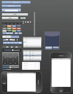
download iPhone illustrator file
download iPhone pdf
and if thats not enough, i built one for the blackberry storm. the UI is a lot less developed as there is almost no consistency across blackberry apps and the device was not released when i made the rendering (and still isnt as of this post)
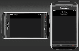
download Storm illustrator file
download Storm pdf
Thursday, November 6, 2008
online social communities
So i have recently over doubled the number of social networks i belong to. I dont expect to use all of them but I am trying to
1a. Make a digital footprint
2b. Discover the positive and negatives of all the interfaces
Previously a member of:
facebook
linkedIn
Blogger
Newly a member of:
xanga, dont plan to use it though since i have blogger
twitter, i know, i'm a late adopter, i think i'm already addicted though
crackberry, though i havent made a username yet
ixda.org
So yeah, overall no one has a completely perfect solution which isnt much of a surprise but its interesting to see the positives and negatives of each.
Oh, and as far as twitter goes, check it out at
twitter.com/dafark8
Basically it is going to become
1a. a list of what i just did and where i am, as twitter was designed for
2b. a list of random design observations and thoughts - stream of consciousness style thanks to mobile
1a. Make a digital footprint
2b. Discover the positive and negatives of all the interfaces
Previously a member of:
Blogger
Newly a member of:
xanga, dont plan to use it though since i have blogger
twitter, i know, i'm a late adopter, i think i'm already addicted though
crackberry, though i havent made a username yet
ixda.org
So yeah, overall no one has a completely perfect solution which isnt much of a surprise but its interesting to see the positives and negatives of each.
Oh, and as far as twitter goes, check it out at
twitter.com/dafark8
Basically it is going to become
1a. a list of what i just did and where i am, as twitter was designed for
2b. a list of random design observations and thoughts - stream of consciousness style thanks to mobile
Subscribe to:
Comments (Atom)