The saturation point is generally referred to a product in society when it has reached the tipping point to use a more common metaphor. Some examples are the abundance of cell phones, text messaging, and in the early 90's fax machines.
Interaction design has reached a saturation point in my personal life. I realized that this holiday season as I bought gifts.
I hate wrapping gifts and have been known for giving them to people in the store bag. My plan was to follow this tradition.
That was until I realized the whole point of gifts is the experience of unwrapping them. I don't see the purpose of wasting paper wrapping a gift but I more than respect the experience expected. Receiving a gift is not about what is inside. Instead it is similar to a video game. What I am talking about is the element of discovery.
Give someone a bagged gift and it is opened and done with. Wrap it and there is the piece by piece reveal of what's inside.
I took this a step further this year. Giving one friend a series of similarly sized gifts I wrapped each in white printer paper. This effectivley blindboxed the gifts in the baseball card or Kid Robot style of packaging.
After wrapping these toys I could not help but laugh at how much design has saturated my personal life. I have been examining signs and interfaces for years now but this is the first time I conciouslly designed an experience for a friend knowing both the expected goal and the work flow to reach it.
Now at what point is the line drawn between designing social interactions and me just being crazy?
Thursday, December 25, 2008
Monday, December 22, 2008
Failed psychology of waiting lines... Airlines
Airlines fail at pleasing passengers because they fail to sucessfully follow Don Norman's psychology of waiting lines.
Without rewriting Norman's paper, airlines fail to give an accurate wait time.
Sure they give estimated departure and arrival times but they are often delayed, updated, and still incorrect.
Sure there is a line to take off and land but toss bad weather into the mix or low fuel and cutting in line is common.
Add the stale air, confined space, and lack of entertainment, can someone redesign the experience of flying?
And I am back
The last two weeks my iPhone app has not allowed me to publish. I am now enabled to mobile writing again.
Wednesday, December 10, 2008
Smart phones destroy the forgotten password
Smart phones have enabled us to view email anytime, anywhere. With this we have entrusted our devices with our user ID and password to ease our desire for instant gratification.
Now a brief thought experiment...
You lose your smart phone. Your user ID is saved in the device for your bank, facebook etc. All a dishonest individual needs is five minutes of patience after selecting the forgotten password link and they have full access to your account, thanks to the saved access to your email.
So now I ask: how useful is that link when the reset is sent to the least protected account a user owns? What good are passwords at all if they can be so easily reset?
The next step in mobile security needs to be developed and sent to market immediately. If I had the solution I would be doing more thanbloggibg about the problem. Instead I wait and watch. What will we see.
Biometrics?
Face recognition?
An increase in challege questions?
The balance has always been between uniqe passwords and memorable passwords, ease of access for account owners and protection from fraud.
Friday, December 5, 2008
Good Marketing?
Driving out to Squirrel Hill recently I saw a billboard that read:
Text BELIEVE to shortcode.
Now I don't remember the short code and have no intention of sending that message but it got me thinking about some new marketing technology has enabled.
The billboard was consumed with maybe 18 characters total. And they were white letters on a red board. Very noticeable-very clear- the message told me what to do and it was my decision wether or not to follow it.
I am curious though what type of information I would have received had I sent that text.
I assume it is put up by a religious organization so would I get a quote from a book of prayer?
Would it start an SMS conversation with a higher being?
Would it charge my account an absurd amount of money?
What type of spam list would I be subjecting myself to?
Or is it all an elaborate social experiment of a bored researcher to see how many hits the billboard will actually summon.
Regardless of the reason the direct messaging is fascinating and I am curious how the marketing team decided on a brief viral campaign over an image or text heavy message.
Wednesday, December 3, 2008
Is print dead? How we get the news
An interesting observation today as I eat my lunch.
I sit in my chair eating and reading articles from my iPhone.
The other designer in my office sits, eating his lunch, reading news articles from the newspaper.
So I ask, is print dead? Many would say yes or at least that it is a dying media. It is interesting though how two people can access the same information from different sources.
Really that's not the interesting part but our choice in methods. I have a background in industrial design and HCI. His background is in graphic design and information architecture. That being said our choices for how we reach media is clear.
He is grounded in the tangible print while I am grounded on the multimedia realm. One is not better than the other and there is no right and wrong. I find it curious though how our training permeates through every part of our lives. It also shows the importance of understanding the entire work flow and process of a user. People don't describe their motivation. Look a little closer though and reasons for choosing chocolate over vanilla are clear.
Sunday, November 30, 2008
My airport rant
I have always beleived that airports are the one place that show people in their true form. Everyone has a destination a mission and it is interesting to watch the different personalities. I am no exception to this either.
Today, the Sunday at the close of Thanksgiving weekend, I have missed my connecting flight. A combination of weather, human error, and preventable measures by the airline such as waiting five minutes for my flight to arrive could have avoided this post and my now four hour layover.
Still all of what I have written is just to introduce the true confusion. Knowing I need a flight to Pittsburgh the airline attendant tells me I am on standby for a two-legged flight leaving in five hours. I was already on one leg and did not want two more on top of my new-found delay so I ask if there are flights on any other airlines. I am told they cannot interface with the other airlines from within security and they cannot help me. Calling my family we are able to find a direct flight leaving in half the time weather permitting that is cheaper.
So now I am waiting for the cheper, direct flight and I ask:
Why can anyone with an Internet connection reroute my travel plans from essentially anywhere in the states but the attendent at the airport can't even col up my flight information?
Thursday, November 27, 2008
When do names catch up with technology?
The carriage became the horseless carriage and is now called the automobile or the car.
Cellphones are slowly going through the same transformation. As technology changes the actual system no longer exists. Cell phones are being called mobile phones or mobile devices on a more frequent basis. This is an appropriate transition considering fewer and fewer calls are made using the cell technology of the early eighties.
Still on the plane today the pilot asked that all electrical devices be turned off including cell phones. This prompted this thought knowing that mobile phones do not interfere with plane signals. Believe me, I am glad people cannot talk on phones in airplanes. It does make me wonder though when society catches up to technology.
At what point will airlines no longer refer to cell phones? Is it one final technological leap we are waiting for or is there a social tipping point when terminology changes. What is the needed saturation point for technology's appropriate or correct term to make it into the mainstream?
Everyone understands usability
It's true. On some basic level everyone understands usability and the difference between what is said and what is meant. It is the common example when a user says they want a handle on a product they really are saying they want to be able to move it from one place to another with ease.
The same happened on my at to the airport this morning. Pulling into departures the cab driver asked what airline. Tired and without thinking I responded that I already have my boarding pass - any door will do. Now I was not thinking "what does he mean by this question?" instead I implicitly understood why he as asking my airline - not to make conversation but because he knows the pairing of doors to airlines and he can make my morning easier. As the passenger I would normally make this assumption and provide my flight information.
Maybe it us because Pittsburgh is a central check in with the gates in a separate building and drop off points are limited but this brief interaction shows that everyone understands usability. The driver did not ask what door I wanted and I did not respond with unecesarry data.
It is always interesting to see real world applications of tools and methods that interaction designers and researchers use and act as if we discovered.
Wednesday, November 26, 2008
No wonder users are confused
The topic says it all. I have been in my apartment four months and just this morning I noticed what is wrong with my range. And no I am not talking about the mapping of burners to controls. What I mean to discuss is the labeling. Both my microwave and oven are Whirlpool and one is positioned above the other in typical kitchen layout.
Still, the control on one reads "cancel/off" an the other reads "off/cancel". Now these ate two devices, often paired and the language is different for be same action. This then led me to think about other repetitive and confusing commands. Keyboards have enter and return keys. A logical and necessary separation in the days of typewriters. But wholly useless and confusing in modern day computing. I can tell you the technical separation between the task but not the axtuallbreapn the two are still separated in modern computing.
Even in he iPhone there is a done send and return button on my interface. Which performs what action? The only way to learn is to try and risk losing my data.
It is with this in mind that I challenge designers and corporations to design consisent products and identities. I can offer more examples both win the iPhone an elsewhere but I fine it interestingbto discover where systems are inconsistent. A company can not assume a user should see a solution without proper design and the first step toward this is consistency in one direction or another.
Tuesday, November 25, 2008
Now I can post my gripes
An aside: u found a free blogger application for the iPhone. I can't tag posts or edit the tyeface but at least I can post and modify the appearance later.
To start, this will not be a very technical post instead a compokagion of some of my initial iPhone reactions. I am trying to publish where I stand on the battle for iPhone functionality and don't intend to uncover any new truths. Topics will be described byname, my awareness to them prior to purchase and my current feelings gowards the mater.
Copy and paste
Known
Agreed
Nothing new to add to what the Internet critics gave already said.
Notification LED
Known
Underestimated, disagreed
I thought this was a minimal complaint of balckberry converts. It would be great go kniwnif k have a missed call without interacting with the device and, perhaps more importantly, know if the device is evenin.
Better camera, flash
Known
Disregarded
Owning the device though, I wish it had both
Customization of hiding unused native apps
Unknown
Wanted
I have a sutuon for the application I am designing, why doesn't apple?
Landcape keyboard in more applications
Known
Disagree
I initially thought I would want this. As I peck at the portrait keyboard writing this post and autocorrect covers for the size of my finger, I was wrong. It works great as is. It might even be faster given the Fitts law sudd of life.
Battery life
Known
Underestimated
But this kachina needs it.
Customize dictionary
Unknown
Wanted
Why can I turn off autocorrect thanks to firmware 2.2 but I can't add my own shorthand? Rimm definitely has the victory here.
Multiple apps
Known
Agreed
Though in all honesty they need a better battery first.
Louder ring, better vibrate
Known
Underestimated
But if my phone is in my pocket on the other end if my short desk you might as well put up smoke signals.
So I said nothing
New but I felt obligated to post my iPhone wishes now that I am a full user for a week
Saturday, November 22, 2008
Designing Products and Designing Cases
Industrial design has always had to fight the belief that designers are simply decorating a functional object. It wasn't until the early 20th century that designers started manipulating materials in a way that the world started looking at products as designed objects and not just functional tools.
Jump to the present day, corporations are hiring designers left and right to try to make their products on the cutting edge. Apple has been at the forefront of the market in computers, mp3 players, and recently mobile phones. Having just purchased my iPhone and joined the smartphone world, my post will focus on that.
Along with my iPhone, i purchased two items: a screen protector and a case. This made me think: Apple spent countless hours developing the iPhones interface and physical form. As the end user, I bought the phone for these reasons and feel that the device itself it an elegant piece of design. I do not want to scratch it, dent it, or in any other way hinder the design. So what do I do? I put the phone in a case. I no longer see the clean plastic back, the sharp edges or the overall form obssessed over by Apple designers for so long.
So my question is two fold:
When does an object become so well designed that people are afraid to use it in its natural form for fear of breaking it
and
When should a case be designed, used, and obssessed over as much as the form it supports?
Cases are by their very nature a protective service against the elements. But when we are dependent on a shell and that is all we see, the case should be attractive as well. There is a limit though - for if the case is too attractive then would we need a protector for our protector?
What are the limits on clean design and when is too much reached?
Friday, November 21, 2008
Intuitive versus Logical - The Blackberry Strom Keyboard
When I posted my initial review of the Blackberry Storm a week ago, I mentioned I was dissapointed with the interactions needed to show and hide the keyboard. The system as I interpreted it required a single touch to call the keyboard to the screen and three steps to hide the keyboard. Since then, I have learned a second method to close the keyboard:
Simply swipe in a downward motion across the keyboards overall target area and the field will dissapear.
When I first read about this feature I thought "wow, how intuitive". In closer inspection of the interaction, I realized I mislabeled the interaction. There is no affordance (to add to the abuse of the term) that the keyboard closes at all. No virtual hinges, no hatch marks or trianges to denote any type of interaction. It was with this in mind I rephrased my discovery to "wow, how logical". The entire interaction makes sense after all - once it was shown to me. I thought "how could I miss that?!" If I were a random user I would have accepted it as a great solution and should have known better.
That is not the case though. I do know better and it shouldnt be the user who feels responisble for 'you shoulda known'. The only reason I discovered the interaction is because, in my waiting for the device to actually release, I read every piece of documentation I could get my digital hands on. That is not normal. I never read manuals and I would be shocked if the majority of people read much of them at all.So yes, I will admit in the UAR world this is a minor problem with easy learning and little persistence. But the feature is so rich that it should be learnable.
So to return to the subject of logical and intuitive. Logical interactions are not a replacement for intuitive interactions. A system is no good if the user spends half of their time not knowing about a rich interaction. (based on the two year contract for mobile phones) There should always be some way to display action and direction of functions, even if it is easily learnable. I want to clairfy, this is not an excuse for ad hoc overbearing labels, tags, and callouts. The system should intead talk with the user and not to it. To interact in a subtle way without additional clutter (remember combinatory explostion from psychology?) It is the challenge of interaction and interface designers to find this balance and I challange RIM to offer an alternate solution to this simple design issue.
When does Feature Creep Hit?... the iPhone
Feature creep, the swiss army knife effect, Ockhams Razor. Call it what you will. They all discuss the same thing - simplicity - the fact that the simpler and more elegant solution probably wins.
So what is the threshold, or tipping point, for feature creep? How is it measured? When does a tool begin to lose its utility due to an overload of function?
When the iPhone was first launched is had 18 (?) applications. There was no third party application store and firmware updates were to fix first generation bugs. Jump ahead ~18 months and we have pages of applications and Firmware 2.2 releasing mere weeks after 2.1. Looking through the App Store, I see over half a dozen instant message applications, more RSS feaders than there would be sites in my own, and multiple applications offering the desired copy and paste function. The firmwar updates are now adding features to keep up with the market, on top of their functional advances. So when does this overabundance finally hit the point where the iPhone is no longer graceful in its function and it is instead another clunk tool? I recently came across the sit of http://pleasefixtheiphone.com/ Many of the requests are known and have been addressed, or at least acknowledged, by Apple(notorious copy and paste push, camera quality.) Others simply cause me to shake my head and wonder. Feature requests range from drop down menus to zooming into video playback, to being able to use the iPhone as anything and everything under the sun.
This makes me think of the story "if you give a mouse a cookie". Well, Apple has opened pandoras box with the AppStore allowing third party developers to fill the gaps Apple is leaving open. Some Apps have been refused only to appear in a Firmware update. That leads to the main question of when should a feature make the leap from third party development to a native feature? When does Apple daw the line and what will set the iPhone apart from Windows Mobile and Blackberry devices when that time comes?
So I do not offer a solution here. I only ask the question that feature creep is about as unavoidable as Kleenex being synonymous with tissues and when it happens, how do you keep your product separate from the mass?
Friday, November 14, 2008
RIMM, you convinced me to buy an iPhone
Anyone who knows me is fully aware I have obsessed over the pending release of Blackberry's first touch screen device (the Storm, scheduled to be released November 21) for the last 12 plus months.
This morning I had the privilege to play with the device at a 'first touch' event and, though it was still beta software, I got a good feel of the device. Overall, I was not impressed. That being said, I kept the words "not final release" repeating in my head but I think I did a good job of separating beta release issues from true technical and interaction issues.
The top ten reasons I am disapointed with the Storm, in no particular order:
1. Haptic feedback
Over the last year I was led to believe the Storm would provide haptic feedback similar to the Verizon Voyager with a grid of speakers and localized bounce upon selecting a screen item. Instead, the whole screen is a single button, in a similar fashion to Apple's new track pad on their notebooks. While I think this could work on a notebook (haven't had the opportunity to try it) I think it completely defeats the purpose in a mobile device. Users rely on physical feedback to blindly type and find buttons in their pocket but that is not possible with a single feedback source. The entire concept of haptic feedback is voided by the inefficiency of the solution.
2. Suretype - Keyboard
They still use multitouch or suretype (user controlled preference) as the input method in the portrait mode. Apple was able to fit a QWERTY keyboard in portrait mode, why cant you? Suretype does not work for a touchscreen, plain and simple.
3. Suretype - navigation
The Storm does a great job of separating TAP from SELECT. Being said, target areas in lists are too small at the default size and I tap at a force deemed a click. Now this, I will outright admit is a learned motor skill, and the sensitivity can be changed but I like to think some basic testing could have uncovered this. Also, the need to tap a selection, then click it again (yes, you can click right away but then there is no confirmation that I selected the correct field) adds roughly 60% more keystrokes to my workload. (That statisitc has a 40% error to it and was made up entirely for this post.)
4. Keyboard Access
The combination of a touchscreen and a physical set of keys is bold (blackberry pun intended.) To open the keyboard is more than easy: tap a text field or select the keyboard icon. To close it, I need three keystrokes and to switch between input methods each time.
Step 1: Switch from typing to the physical blackberry menu key
Step 2: Switch back to the touch screen and scroll through the menu to find "close keyboard"
Step 3: Tap or Click my selection.
Now it was mentioned you can close the keyboard with a toggle. I couldn't find it and I had close to a half hour with the baby toy. Unfortunately, the representatives were too busy trying to sell the devices to help out a designer.
5. Browser
Simple put, I love the full html, alleged flash support (no time to see it but asked about) and the ability to switch to a mobile browser view. Being said, the overall interface is clunky and needs a touch screen redesign.
6. Icons, Animation, and Rendering
Tip of the hat to the designer who used color sparingly. This is a nice step from the single color gradient iPhone apps. Being said, the stroke on the icons is far too thin causing be to actually have to read labels. In the animation world, I am going to chock this up to BETA. I saw none of the advertised animation when switching device orientation and flicking was more a stepped jump than any type of accelerated/decelerating motion.
7. Predictive Type
Does not work in non-conventional fields such as URL input on the browser or where I need to put in my email address. Just shouldnt be there and it is.
8. SMS
Completing the TO field I switched to number mode in the keyboard (landscape mode).
1a. The numbers are ordered in a keyboard layout in cellphone order. Which makes no sense to any mapping technique. What happened to top row numbers?
2b. The numbers switch back to letters after each character. I am sure there is a way to change this but device: have the smarts to know if this can accept names OR numbers, and I type a number, the rest of the string will follow suit. I will tell you if the number is 412.867.530P
9. Zoom
Yes, I know Apple has the Monopoly on multitouch and hence the awesome zooming. Still, the zoom in zoom out toggle is a little too 1995 for me. See my final thoughts on that.
10. Paging
I realized this one a few hour after my initial notes. But every app for the Storm is listed on a single page that you must scroll though. This makes it difficult to know where you are in the list and how many you have. The iPhone offers a nice organization methods, so you can categorize applications any way you see fit... and they have those clever dots to let you know which page your on
11. Nickel and Dime
So not a design issue, but I feel Blackberry is really good at charging for every little feature. Granted they are a business centric not a consumer centric product, but they even charge for visual voice mail... a free utility in iPhones.
What I Would Like to See
Go back a few years ago to the blackberry without a trackball but an infinitely scrolling side wheel. Now use that to zoom in the website as you select.
Use that to navigate the Copy and Paste Function.
Use the accelerometer better... BRICKBREAKER... easily the selling factor for a blackberry user on the subway. Except I need to click and drag the bar across the screen. What happened to using the accelerometer to tilt the device? Or does Apple have the rights to that also?
Conclusion
So the Storm is innovative, sexy, and awesome. All true. I can't wait to see the second release though because as of right now, its lacking a lot of fixable functionality and interactivity. To use the Storm metaphor RIMM loves, they're at a Category 1 or Tropical Storm grade, far from the Category 3 Hurricane Andrew from 1992 or Katrina, or anything else.
-IMHO
Monday, November 10, 2008
mobile templates
as discussed earlier, i found a great psd file of the iphone and all its elements. I am much more an illustrator user/abuser though. here is my iphone element doc
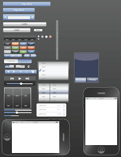
download iPhone illustrator file
download iPhone pdf
and if thats not enough, i built one for the blackberry storm. the UI is a lot less developed as there is almost no consistency across blackberry apps and the device was not released when i made the rendering (and still isnt as of this post)
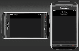
download Storm illustrator file
download Storm pdf
Thursday, November 6, 2008
online social communities
So i have recently over doubled the number of social networks i belong to. I dont expect to use all of them but I am trying to
1a. Make a digital footprint
2b. Discover the positive and negatives of all the interfaces
Previously a member of:
facebook
linkedIn
Blogger
Newly a member of:
xanga, dont plan to use it though since i have blogger
twitter, i know, i'm a late adopter, i think i'm already addicted though
crackberry, though i havent made a username yet
ixda.org
So yeah, overall no one has a completely perfect solution which isnt much of a surprise but its interesting to see the positives and negatives of each.
Oh, and as far as twitter goes, check it out at
twitter.com/dafark8
Basically it is going to become
1a. a list of what i just did and where i am, as twitter was designed for
2b. a list of random design observations and thoughts - stream of consciousness style thanks to mobile
1a. Make a digital footprint
2b. Discover the positive and negatives of all the interfaces
Previously a member of:
Blogger
Newly a member of:
xanga, dont plan to use it though since i have blogger
twitter, i know, i'm a late adopter, i think i'm already addicted though
crackberry, though i havent made a username yet
ixda.org
So yeah, overall no one has a completely perfect solution which isnt much of a surprise but its interesting to see the positives and negatives of each.
Oh, and as far as twitter goes, check it out at
twitter.com/dafark8
Basically it is going to become
1a. a list of what i just did and where i am, as twitter was designed for
2b. a list of random design observations and thoughts - stream of consciousness style thanks to mobile
Wednesday, October 29, 2008
iphone GUI link
So i want to make my writing in the blog slightly more regular and documented. That means not just the once in a blue moon sitting on the toilet design idea (thats where all the good ones come, right?)but also just nice observations and findings in the design world. That means two things
1a. i am going to start storing links i like here for later use when i cant remember where i saw something
2b. i am going to start tagging these post! who would have thought someone invested in usability and interaction would not be tagging his posts to make it easier to find.
So to start, here is a link i found a few months ago
Great if you need to toss together screens for an iPhone interface. Mad props to the creators of this file and for publishing it to the net. I have a strong tendency to use illustrator over photoshop though and rebuilt all of the elements in a glorious .ai file. Soon to be posted though I havent placed it anywhere on my server yet.
Monday, October 27, 2008
a designer's personality...
an interesting observation of late:
are all designers trained to hate the world, and thats why we strive to make it better?
i have always had a certain amount of crowd anxiety, frustration with servers at restaurants despite being one not too long ago, and have shaken my head at the behaviors of people so immersed in their iPhones they almost cause accidents crossing the street.
i always thought it was me, and yes i know that falls into the narcissistic behavior of everyone as well. but then i was at dinner last thursday with a former professor of mine and at least three times during the meal that i can recall, we looked at each other and shook our heads in reaction to people in the environment. our server was less than enthusiastic about working a thursday night, other customers disregarded the public setting yelling at their loudest, and all we did was shake out heads in dismay.
so, my question is simple. where as designers do we draw the line between observing the world and society and being a member of it? when must we stop criticising people and realize that we too are human. i feel that as designers we take it for granted that we understand how a system works and how a story is told, but at what point do we become victims to our own skills and personalities? at what point are we as guilty as the users we shake our heads about in the restaurant.
Monday, October 13, 2008
It's the same everywhere...
Dont think for an instant that becuase you work for a corporate design office, or a smaller consultancy that things will be different. From my observation, the design industry as a whole is so young that in either environment the same issues persist. For an industry based around promoting consistency for usability, both environments lack it. From my recent discussions with friends in consultancy positions, it has become clear that all of us struggle to find internal design guidelines by which to make public documents.
This makes me questions how we, as designers can convincingly communicate to the world when we ourselves dont have a cohesive method of communicating between each other. I recently read a post on ixda.org discussing the changes in the profession and how designers change forums as the title by which we go by shifts. This goes along the same lines. As long as there is no standardization of what we do, it will be difficult to find it in our products. Still, we as a design community come up with great results to challenging design problems. I am curious though to see what else could be accomplished if designers didnt have to reinvent the wheel every time a spec document was built, every time a work flow had to be modeled.
This makes me questions how we, as designers can convincingly communicate to the world when we ourselves dont have a cohesive method of communicating between each other. I recently read a post on ixda.org discussing the changes in the profession and how designers change forums as the title by which we go by shifts. This goes along the same lines. As long as there is no standardization of what we do, it will be difficult to find it in our products. Still, we as a design community come up with great results to challenging design problems. I am curious though to see what else could be accomplished if designers didnt have to reinvent the wheel every time a spec document was built, every time a work flow had to be modeled.
Tuesday, October 7, 2008
Irony...
Just an interesting observation about my current path with design.
Freshman year at Carnegie Mellon I applied and was accepted to the dual major program in Human Computer Interaction. Being asked by family and friends what that actually was, I began using the phrase "cell phones and atms". This was generally accepted by my audience in that everyone has had experience with shoddy cell phone interfaces and how they map, or dont map, to the physical device and everyone has had experience with ATM machines.
Lo and behold, now I work for PNC bank. The focus of my work is on mobile banking. So, I am not doing anything with ATMs, but I sure am in the financial market, designing cell phone interfaces, keeping in mind the physical and digital realms and their overlap.
Just some entertaining thoughts.
Tuesday, September 23, 2008
Hyperlink Blue
Was there a convention twenty plus years ago in which they decided hyperlink blue had to match infomercial background blue and both had to be horribly disturbing to the eyes and distracting from whatever the actual product is? Although in the case of infomercials, there generally is never any actual product anyways.
Friday, September 19, 2008
Criticism and non Designers
"When we are having a critique, we are not discussing you as a person, we are discussing your work."
This is the tagline of any critique during my four years of design at Carnegie Mellon. Classmates and professors are not criticizing you as a person, they are not criticizing your beliefs or your personality, they are not discussing your ability as a designer, not in that conversation at least. They are discussing the design currently on the wall. After four years of this as well as the years of art education before university, I have grown fond of the critique environment where nothing is out of line and all comments are directed towards the work, not myself.
Now in the real world, and the corporate world at that, I need to relearn this method. Over the last week, I rendered a variety of sketches for a range of projects I am involved with. Sharing my sketches I was asked more than once if the critisicm is too harsh, or if I am OK with the judgement being passed. To me, the judgement being passed and the criticism offered was minimal and lighthearted to say the least. There was good criticism and bad but I saw it as constructive criticism about the work, not about myself. I thrive on it to make the work better. Otherwise, my personal standards would drop and my quality of work would decrease.
Then I received renderings from other individuals in the organization who lack a design background. Reading their comments and reviewing their renderings, I understood their motivations for various elements within the interface but knew the overall layout did not work and the system as a whole was flawed. I know though that bedside manner is a weak spot of mine. And I know that many people take criticism of their work as a personal attack. So it was carefully that I had to redraft my comments to show how all of the concerns they listed, and more importantly the ones they did not list are addressed in the current design.
It is an interesting balance between the design world and the rest of the business community. We thrive off of criticism to push us further and create better products. The majority of people feel attacked in the same setting. I know this is one thing I will just have to get used to, but it is interesting how it has affected my work and I look forward to seeing how my work model will change as I have to teach people it is OK to tear my work down... as long as it is my work and not me... and as long as it is constructive and not spiteful. Thin lines that take a very careful skillset not to cross.
Saturday, September 6, 2008
The Desktop metaphor... dead
This is not a compeltely original thought. I wish I could find the literature that initially put it into my head, but alas, i cannot. Still, i will rigth here to describe a simple thought:
the concept of the desktop in relation to a computer is out of date.
When computers were first developed for consumer use, they sat on desks. The interface, once we got past the single line input, received a metaphor of a desktop equating the computer screen to the desk it sat on. This worked quite well considering files were primarily text based, kept in folders, and this matched the physical world quite well.
In present day though, this does not compute so to say. With laptops the ever popular computer, mobile devices gaining an ever increasing market share and ubi-com becoming less and less a thing of science fiction, we need to step away from the desktop metaphor. People no longer sit at their desks and check email, write in blogs, and perform day to day business and personal functions. That being said, the desktop metaphor does not apply.
Apple tries to address this in their iPhone, by calling the screen with the application icons the home screen. This too though, is inaccurate. Home screens refer to the page within a web browser upon opening the application. I do not feel it can apply to the departure screen of a computing device though.
I do not have the solution to this dilemma of language. I simply propose that designers and developers needs to look at the language of the products we use and design and realize that much of the hurdles we must overcome are based on innapropriate titling of items commonly used.
Friday, August 1, 2008
School and Work
It has been quite a while since I have written anything on this blog. Part of that reason is I was traveling, partly I was lazy and enjoying my vacation between graduation and work, and the last two weeks, since I have started work, I have been a little distracted. That being said, I am going to skip any writings about my trip right now and I am going to go straight into the topic at hand:
Training in school for work.
No one told me that Carnegie Mellon actually prepares you for the real world. Going into work the first day, I had a flashback of four years ago where I was told the four stages of design:
Unconsciously incompetent, where you don’t know what you don’t know.
Consciously incompetent, where you know what you don’t know.
Consciously competent, where you know what you know, and you do it knowingly.
And Unconsciously competent, where you know what you know, and you do it naturally.
Now walking in the first day, I very quickly learned that I am unconsciously incompetent. That being said, by the end of the week I had graduated to consciously incompetent. I am still there. Still, it was interesting to see the same growth from four years ago happen in another cycle. Still, even more interesting is the value of the lessons I learned in school, even though I forgot them temporarily. In making a series of flow charts and deliverable lists, I made some great progress in the designs, completely forgetting the audience… the President and other executives of PNC Bank. Immediately I went back and reworked everything for the public view, remembering and reteaching myself the tried and true principle that anything in design is based around communication to an audience.
Well, this gets me back in the writing seat. Sorry there isn’t much content here, but no one actually reads this now, I think.
Saturday, May 3, 2008
An odd reflection on some good design

I am currently entering my last two weeks of being an undergraduate student at Carnegie Mellon University. Knowing that the time between graduation and work is the last uninhibited vacation for a long while, I am planning a Eurotrip to Greece and Italy with a friend from highschool. Among the travel plans, i needed to get a watch (i do not want to lose my pocket watch in europe). Knowing all I need is a cheap digital watch with an alarm, my father purchases and sends me a watch that he found. He sends me the Casio F91. Now I am sure the people who know that model by name are numbered, so here is a pretty picture.
After opening the package these were the thoughts that went through my mind:
"wow, i havent seen this watch model in years"
"i remember the band snapping off"
"its sort of the 'my first real watch' watch for young children"
In short, I remembered having this exact watch when younger. When putting it on, I felt how light and inexpensive it was. Then, i went to navigate the three buttons on the unit. In less than a minute, I had exhausted every function of the unit. This is said in respect, not insult to the device. The fact that a system I have not experienced in well over a decade comes back so naturally is an achievement of the designers. Granted the watch only has three buttons - but I have seen many systems that take simplicity of form for granted in an ever confusing hierarchy of actions. The ease of use of the watch is an impressive feat for any designer, especially considering this watch was probably designed well before interaction methods and usability had the buzz worhtyness they do today.
So in the end, this is just a tip of the hat to the designers and engineers of the Casio F91 digital watch. A beginner watch no doubt, its interface shows simplicity and function very well.
Tuesday, April 1, 2008
A rant on computer's memory and my own...
I remember a lot of things. I can tell you about an argument five years ago, or what the weather was that day in the second grade that I realized clouds shouldn’t be drawn blue to save crayon. When it comes to computer systems though, I could not tell you what the warnings are for different applications and what the repercussions of ignoring them are. When confronted with these stop signs, I generally ignore them knowing that the outcome, in that particular case, is acceptable. Having said that, the next time I use the application it might be different. This brings up the issue of the modal dialogue box:
“Warning. If you continue such and such will occur.”
Your options are to continue or cancel. You also have the small radio button to never show this warning again. Now, I recently started choosing the never show me this again option because, when exporting a series of files, it gets very annoying to constantly see this window. The system should remember my choice, shouldn’t it? (Thanks Alan Cooper and the authors of About Face for this insight). Still, when I return to the application a day later, I might be working on a different project and I do want this warning. From this point onward though, I have essentially shot myself in the foot. No longer will I receive the warning that the transparency will not transfer or that the hidden layers will print. This must forever be stored in my memory.
As I said at the opening, I have a good memory. Ask me what your favorite color is after not seeing you for four and a half years, I will probably remember. Ask me what the repercussions of ignoring a computer warning? I will probably make a joke about the nostalgic blue screen of death or the more topical beach ball of death. The system needs to be able to realize when a command is being ignored during a specific instance and when a warning is being ignored for ever. It should not expect me to remember things that are written in such an obscure manner that, well, only a computer can understand. Systems need to learn and be programmed with a certain amount of logic and persistence, beyond the standard on/off switch we have all been forced to submit to.
Sunday, March 9, 2008
Mechanical Age versus Informational Age in Learning
Coming home for my spring break vacation, I had many things planned: visit friends, relax in the warm
It wasn’t until I got the computer functioning again today that I realized this hesitance to format the computer is the same as my friend’s hesitance to use power tools. Back at school, I am involved in construction for our Spring Carnival. On a team with a handful of students who have never used power tools, I have become a sort of teacher in the way of power drills and the glorious dremel. No expert, I simply approach the problem and play with the materials until I get the desired outcome. The obvious physical risk of power tools aside, some of the others in the organization are afraid of the tools much the same as my parents don’t want to reformat their computer. The curse of the beginner, they have simply never used the tools or carried out the function and due to some perceived barrier they delegate it to someone who is deemed more skilled, even if I just button mash (my generation got something out of Nintendo).
In this way, I find it interesting that the mechanical tools and the digital world have this similarity. It shouldn’t be any sort of surprise, people hate being novices and looking inept at a task. Still, there should be a way in designing interactions and experiences that makes it easy for the novices to step up and feel confident in using the application. It is too easy to forget what it was like being a beginner at something, especially if you learned it at a young age. Although people are novices for a short time and learn quickly, a poor introduction to a system, interface, or physical product might turn them off from using the system any further.
(no big closing, here ends my observation.)
Wednesday, February 13, 2008
Meeting Consensus
An interesting thought came up at a lecture recently. It was stated that it is better for the ultimate design if everyone leaves a meeting slightly unhappy than if everyone is happy, or if one specific team always wins. Having never thought of this before, I was curious to the rationale. Once provided though, it made a lot of sense.
The reason behind this is simple. Say there is discussion between the designers and the programmers. If the designers always win, it was mentioned the code will suffer. Conversely, if the programmers always win and implement the easier method, the design will suffer. To expand beyond the lecture, I can see this happening for many reasons. To use the cliche, you lose the forest in the trees or the trees for the forest, whichever you prefer. A more imminent threat through is a loss of stake in the product. If your team finds they are consistently getting steamrolled into submission, the ideas that come out of the department will quickly suffer and the entire project will be of a lower value.
For this reason, I believe it is important to "air your laundry" so to speak when in a group dynamic so that negative energies do not build up to explode later. On the same note though, there must be compromise and the ability to move on once a disagreement has been aired, addressed, and reasonably solved. This will not only allow the design process to move forward but will also spur additional creative thought as all ideas are valid and there is no ultimate iron hand that makes all the final decisions.
Tuesday, January 29, 2008
Affinity Diagram IceBreaker
Blame it on my being overly involved in Orientation, Pre-College and Admissions. Maybe I participate in too many ice breakers getting to know complete strangers in a relatively short manner of time. I found a new metaphor for the literature review and affinity diagram stage of a project.
These steps are the Icebreaker. In a social setting, icebreakers are used to introduce strangers and to facilitate trust in a short period of time. It is much the same with affinity diagrams and literature reviews. Both of these methods facilitate trust among the team members as well as providing an overdose of information very quickly. Even in teams that have worked together in the past, there is the new “member” of the project space that must be introduced and this is a vita part of the project to lose inhibitions and truly embrace the project.
These steps are the Icebreaker. In a social setting, icebreakers are used to introduce strangers and to facilitate trust in a short period of time. It is much the same with affinity diagrams and literature reviews. Both of these methods facilitate trust among the team members as well as providing an overdose of information very quickly. Even in teams that have worked together in the past, there is the new “member” of the project space that must be introduced and this is a vita part of the project to lose inhibitions and truly embrace the project.
Friday, January 25, 2008
An Introduction...
I've held many blogs in the past. None of them have ever lasted, and none of them have ever amounted to much more than a compilation of strange stories or listing of information I don't really care to keep. More often, I find myself writing in personal journals. Much of what I write I have never wished to share, being a self inspection of my actions.
As I start to look beyond my existence as a student of design and look for a position to practice it as a professional, I find myself discussing methods and techniques with others that warrant a certain amount of criticism. Unable to achieve that in my own journals, I plan to use this blog as a means to express my various editorials on design in an attempt to better understand my process as well as my needs in the upcoming years.
As I start to look beyond my existence as a student of design and look for a position to practice it as a professional, I find myself discussing methods and techniques with others that warrant a certain amount of criticism. Unable to achieve that in my own journals, I plan to use this blog as a means to express my various editorials on design in an attempt to better understand my process as well as my needs in the upcoming years.
Subscribe to:
Comments (Atom)